But my gripe with the film is not that the trailer is lacking non-screaming females. It is not that I am never very excited about remakes that were great the first time (I haven't seen it, but Prince Humperdinck plays the vampire, so it's gotta be good.)
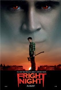 No, my gripe of the day is the movie poster.
It's kind of cool. The lettering is cute and looks like vampire fangs. The red eyes are a nice calm color. I have no idea who's holding the axe. (Tangent: Because it's a guy in a checkered shirt holding a tool reminiscent of a shovel, it is giving me flashbacks to this excellent Cracked video.)
Anyway, as I stared at this cover, I was struck a certain way by the gaze, the fadeout, the color gradation, and the low light source. I began to feel that the film must be worthy of four Oscars. That it must be gritty, convoluted, sad, psychopathic, greed-filled, all with a southwestern flavor.
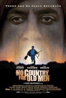 But Fright Night is not No Country for Old Men. The blurb, the trailer, and the actors involved all suggest a wildly different tone. Violence is the sole connection. And Fright looks cartoonized. Why then make the decision to channel No Country for Old Men? Fright Night may be no country for nosy teenagers, or no country for vampires, but the Fright cover mainly makes me want to watch something Coen brothers. Success in advertising? I think not. The only perk I see is cranky people like me writing cranky blog posts and increasing word of mouth.